About this video
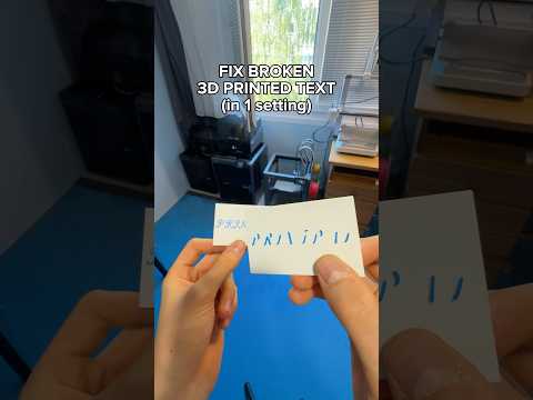
Why text on 3D prints looks bad
Lettering has thin strokes, sharp corners and tiny gaps, which are the hardest features for a 0.4 mm nozzle to reproduce. Most problems come from three things: text that sticks out too far, walls printed too fast, and a wall generator that can't fit lines into thin strokes.
The 3 fixes
- Keep embossed text to about 0.4 mm. On a vertical wall, raised text that sticks out further becomes an unsupported overhang, and the edges droop or fall. Check the emboss depth in your slicer.
- Lower the outer wall speed. In the Speed settings, reduce the outer wall speed so corners and curves come out sharp instead of rounded or wobbly.
- Switch the wall generator to Arachne. Under Quality → Wall generator, choose Arachne. It varies the line width to fit thin strokes, so small letters print solid instead of with gaps or missing parts.
More tips for crisp lettering
- Print text facing up where you can. Top-surface text is the easiest orientation.
- Use a bold, sans-serif font with strokes at least about 0.8 mm wide (two nozzle widths).
- For two-color text, emboss or deboss it by a few layers and change filament at that height.
- Need a text model? Try PrintPal's 3D text generator or name plate generator.
FAQ
Why is my small text missing letters?
The strokes are thinner than the nozzle can print with the classic wall generator. Arachne usually fixes it.
What's the best layer height for text?
0.12 to 0.16 mm gives cleaner edges on raised text and lettering on side walls.